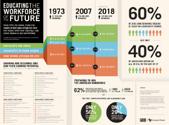
From ANTHEM SIGHTINGS: 10 Trends Shaping the World Today:
8. Beautiful & purposeful: Bringing numbers to life
8. Beautiful & purposeful: Bringing numbers to life
Infographics are nothing new—all kinds of charts and tables, which help absorb information easily, have been in use for years, but today primarily thanks to Internet the amount of information is overwhelming and we need it to be delivered in a more structured and clear way. Simple text doesn’t work here, audience needs data visualization, and web can offer great solutions to complete this task. For instance, Wordle.net can generate fabulous world clouds and via Google Public Data Explorer one can find lots of datasets relating economical and demographical issues.

Comment from Lars Thygesen (lth@dst.dk)via email :
ReplyDelete"I fully agree that infographics can be extremely useful and help people grasp the meaning of numbers. However, I am worried that sometimes we just make fancy infographics because we are able to do so - and we are indeed able to do more and more. But it still takes careful thought to find out presentations that show something interesting. For instance, the picture in this article seems to show nothing. It looks to me like some milk cartons in a fridge"