Saturday, July 30, 2011

Economist introduces stats app

From M&M – NETWORKING GLOBAL MARKETERS  Economist introduces stats app

27 JULY 2011
Economist introduces stats app
The Economist is bringing its World in Figures book to iPhone and iPod users through a new app. 

The app, which is available globally, allows users to access statistics and data from more than 190 countries and covers a range of sectors including transport, commodities and cinema. Users are able to compare data from different countries across one screen, and test their knowledge through a trivia function with the results then shared across Facebook and Twitter.

Monday, July 25, 2011

PC-Axis with R: pxR

PC-Axis with R: pxR

This article was first published on Omnia sunt Communia! » R-english, and kindly contributed to R-bloggers

PC-Axis is a software family consisting of a number of programs for the Windows and Internet environment used to present statistical information. It is used by national and international institutions to publish statistical data. Programs in the PC-Axis family use a particular data file format (see the fullPX-Axis data format description). Now the pxR package is available at CRAN: it provides a set of functions for reading and writing PC-Axis files. This will facilitate the analysis of statistical data to the R community.
The function read.px reads a PC-Axis file from a given location and returns an object of the class px containing all the data and metadata in the PC-Axis file. The single most important piece of infomation with a px object is the data matrix, which can be extracted with function as.data.frame.
For instance,
my.px.object <- read.px("/path/to/pc-axis/file")
my.px.data   <-  as.data.frame(my.px.object)
will create the data.frame my.px.data with the data in the corresponding PC-Axis file.

DataGenie: International visitors to Australia

The link below demonstrates how much China has risen relative to Japan by looking at the number and spending of tourists from those countries when they visit Australia (motion charts shown here are embedded in Space-Time Research's visualisation platform)

http://ivs.datagenie.edu.au/#view=motionChartViewF&selectedWafers=0&selectedColumns=0,1,5,8


With DataGenie explore interactive visualisations based on current data from
the International visitor survey conducted by Tourism Research Australia
  •  Who is coming?
    Number and gender of visitors
  •  Where do they come from?
    Countries
  •  Why do they come?
    Reasons for visiting
  •  Where do they go?
    Regions visited and length of stay
  •  What do they do?
    Activities
  •  How much do they spend?
    Spending patterns
'Tourism is a $41 billion industry, providing careers for almost half a million Australians, and the lifeblood of our regional communities. It is our leading services export, contributing $24 billion or just over 10 per cent of Australia's total export earnings.'
Martin Ferguson AM MP, Minister for Tourism.
Department of Resources, Energy and Tourism 2010, Tourism industry facts & figures at a glance, p 2. © Commonwealth of Australia 2010

The data has been gathered since 1999 and is made available for educational use by Tourism Research Australia.

Australian Government - Department of Resources, Energy and Tourism

Saturday, July 16, 2011

Data journalism, data tools, and the newsroom stack

From O`REILLY radar: Data journalism, data tools, and the newsroom stack

The 2011 Knight News Challenge winners illustrate data's ascendance in media and government.

by  | @digiphile | Comments: 1 |  5 July 2011

 
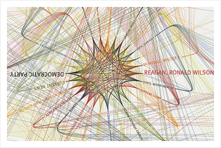
NYTimes: 365/360 - 1984 (in color) by blprnt_van, on FlickrMIT's recent Civic Media Conference and the latest batch of Knight News Challengewinners made one reality crystal clear: as a new era of technology-fueled transparency, innovation and open government dawns, it won't depend on any single CIO or federal program. It will be driven by a distributed community of media, nonprofits, academics and civic advocates focused on better outcomes, more informed communities and the new news, whatever form it is delivered in.
The themes that unite this class of Knight News Challenge winners were data journalism and platforms for civic connections. Each theme draws from central realities of the information ecosystems of today. Newsrooms and citizens are confronted by unprecedented amounts of data and an expanded number of news sources, including a social web populated by our friends, family and colleagues. Newsrooms, the traditional hosts for information gathering and dissemination, are now part of a flattened environment for news, where news breaks first on social networks, is curated by a combination of professionals and amateurs, and then analyzed and synthesized into contextualized journalism.

Data Visualization and the Power to Tell Stories

From CARDUS BLOG: Data Visualization and the Power to Tell Stories

July 15, 2011 - Milton Friesen

I put together this data visualization based on the World Development Indicators dataset on Google (Public Data Explorer) and it shows how many days it takes to start a business in Brazil, Russia, India, and China compared with Canada. You can see how dramatically India has dropped the start-up time period and how Canada has managed to increase the time period from three days to five days. At least one story in these data is the relative ease we have in starting up a new enterprise. While the red tape challenge certainly exists in Canada, it can be worse elsewhere. These statistics don’t speak to effectiveness, unregistered businesses, or other significant factors. I could have chosen any number of countries, comparisons, and representations.
The most critical aspect of this project is the platform that Google has created with Public Data Explorer. You can pick from many public datasets, explore each of them visually, and then share the link or embed it for others to see and use. With the massive sea of data that grows by leaps every day, people who create the platforms for the exploration and communication of this information will be able to leverage those data for various kinds of influence. The use of data will be a key feature of storytelling as time goes on. The great storytellers will be driven by the usual aspects of narrative communication, but data visualization will become a very substantial part of that toolkit. Think tanks, universities, NGOs, government departments, corporations, and other organizations dependent on information need to think not only about individual datasets but about the platforms that will make that information sensible, customizable, explorable, and thus powerful.
Here is an example of global homicide rates. I have selected for representation the highest, lowest, Canada/U.S., and a few others. The output on this is for 2008 represented as a bar graph.
Access like this changes the dynamics of research and puts into the hands of anyone with an internet connection capabilities that were once the purview of advanced researchers and firms. What happens when not only the data but also the means to explore and communicate those data meaningfully is placed into the public domain in a much more accessible way than ever before? Who will sort and review and ensure that the stories being told from those data are in fact substantive and credible? This feels a bit like what happened when music moved from the control of the big labels out into a much more public and shareable space. Data journalism is a growing field that is worth paying attention to. This recent article from Forbesprovides a good overview with great links for further investigation.
You can visit the Public Data Explorer and create your own visualized data.

Tuesday, July 12, 2011

How One Company is Taming Big Data With Visualizations

On my visit to Seattle last month, I visited the office of data visualization company Tableau. As more and more data gets uploaded to the Web, it needs to be analyzed and made sense of. Data visualization is one of the most effective ways of doing this and Tableau is a leading company in this field. I sat down with Ellie Fields, Director of Product Marketing at Tableau Software, to find out how data visualizations are changing the way people are consuming information on the Web.
Tableau's vision is to "see and understand the world's data." The company has carved out a particular niche with media organizations, who use Tableau software to enable their readers to play with data in interactive way - for example customizing charts.

Monday, July 4, 2011

UNECE Work Session on the Communication of Statistics


Document Title
ENG
INF.1
Information notice 1
PDF
3 Mar.11
INF.2
Information notice 2
PDF
Jun 21.11
INF. 3
Agenda
PDF
24 Jun.11
WP.1
Registration Form
DOC
3 Mar.11
WP.2
Organization Report Template
DOC
3 Mar.11

Session 1: Social Media 


WP.3
Is Twitter a Successful Channel to Users: a Case Study (Ireland)
PDF
27 Jun.11
WP.4
Considerations for Interacting with Detractors on Your Social Media Properties (United States)
PDF 
27 Jun.11
WP.5
Digital engagement: two case studies from the UK (United Kingdom)
PDF 
21 Jun.11
WP.6
How Social Media Monitoring Can Help Corporate Communication – From Information Management to E-reputation Management (Germany)
PDF
WP.7
Online Engagement: Gathering Feedback, Successes and Learning (Australia)
PDF 
27 Jun.11

Session 2: Gathering User Feedback from Websites

WP.8
Methods to Improve scb.se With a User Perspective (Sweden)

PDF
24 Jun.11
WP.9
OECD's Approach to Building a User-Centric Website (OECD)
PDF
WP.10
Gathering User Feedback Regarding Statistics Austria's Website (Austria)
PDF
24 Jun.11
WP.11 
User Satisfaction Survey at ROSSTAT (Russia)
PDF
WP.12
UNCTAD: Gathering User Feedback (UNCTAD)
PDF
27 Jun.11
WP.13
Statistics Explained user statistics via Piwik: who is looking? (Eurostat)
PDF
21 Jun.11

Session 3: Internal Communication
WP.14
Internal Communications: Introducing and Managing Change (Canada)
PDF
27 Jun.11
WP.15
A Good Product Needs Good Communication to Succeed (IMF)
PDF
27 Jun.11
WP.16
Writing Together for the Web (Spain)
PDF
27 Jun.11
WP.17
How to Improve Communication by the Use of Workshops - a case Study (Denmark)
PDF
27 Jun.11

Session 4: External Communication
WP.18
External Communication: Audience Segmentation (Mexico)
PDF
24 Jun.11
WP.19
 Taking Control of the Organization's Target Groups (Sweden)
PDF
24 Jun.11
WP.20
Innovations in 2010 Census Communication Campaign (Mexico)
PDF
24 Jun.11