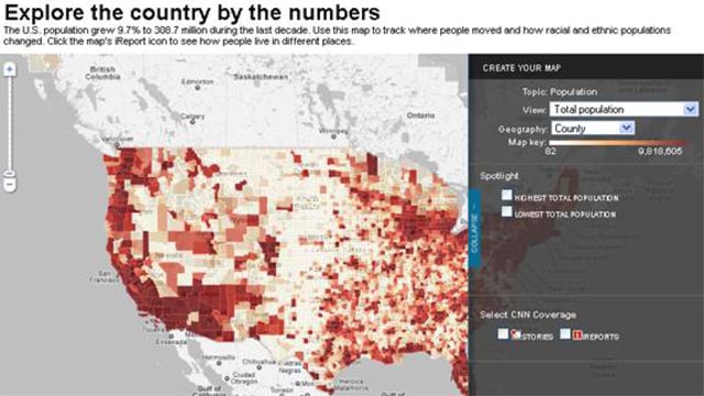
Infographics (or Information Graphics) are graphic visual representations of data information, presented in a way to make it easier to consume information. Infographics gained popularity in the mid-2000′s with the advent of sites like Digg and Reddit, and have quickly become one of the most popular methods to display researched data.
There are three main types of infographics – where data is presented in a timeline, where statistical data is presented in graphs or with icons, or where data is presented on a map. In order to create an infographic which will be widely shared, think about your typography, colours, and layout. Make it easy for people to understand the information that’s being provided. Sometimes it’s best to keep things simple. Sometimes you don’t need anything more than an elaborate concentric pie chart or cool typography to create a visually interesting infographic.
You can also get very creative with how you display your information, and do something completely unconventional. A great example of just how creative you can get is with Squidspot’s
Periodic Table of Typefaces.
Infographics are among the most popular modern methods of sharing information with an audience. If you’ve conducted some interesting research, people aren’t very likely to read an essay, or look at a table of statistics. On the other hand, they’re very willing to spend some time taking a look at an infographic, while also gleaming the same amount of information had they read your research – in a much shorter period of time.
There are a few automated ways you can create your own infographics.
Visual.lywill be unveiling a
tool to do just that, although for the time being you can at least create an infographic with interesting factoids about your
Twitter account. Another interesting and new tool comes in the form of an iPhone app.
PhotoStats makes it easy to create infographics about your iPhone camera use.
Ionz is another service you can use use to create infographics about yourself.
But what if you want to create your own infographic from scratch? This list of tips and resources will give you all the tools necessary to create any kind of infographic you want to.
Where to get visual statistics
When it comes to finding statistics for your infographics, Google is your friend. It’s the fastest and simplest way to get statistics on just about any topic you’re interested in. Aside from simply googling for statistics, you can also go to specific sites to download statistics that have already been incorporated into interesting visuals, or even upload your own statistics.
Chartsbin is an excellent example of that kind of site. You can download or embed any of the existing visualizations, including maps, pie charts and bar charts, all of which are available under creative commons. Signing up for a free account allows you to create visualizations using your own data. Copy and paste your data from a .csv file, and then create a map-based visualization of that data. You can choose between a variety of maps, including a world map, or major regions such as the Asia, America, Africa and the Middle East, as well as specific countries including the US, India, China, Germany and France.
Google’s
Public Data Explorer is home to some visual, and extremely varied statistics including unemployment rates, internet penetration and infectious disease outbreaks in various countries. The data can be presented as a line chart, bar chart or map. Google doesn’t give you any way to save the visualizations but you could simply take a screenshot of the data. You can also
upload your own data sets.
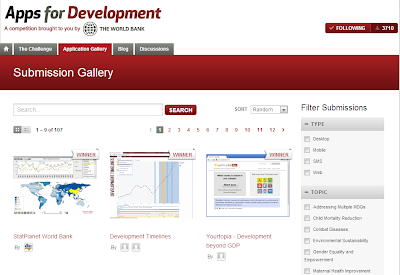
StatPlanet is another good source for both statistics and visuals. Like Chartsbin, you can create your own interactive maps, as well as graphs, and access statistics from their own maps. StatPlanet is available as a free Windows Flash
download. StatPlanet is a little bit more complicated to use than Chartsbin, so if you’re looking for the easier option definitely stick with the latter. If you want a more elaborate map, StatPlanet will suit your needs. When you download StatPlanet, it comes with a .csv file demonstrating how you have to fill in your own data for it to appear on the map. The default download has a world and USA map, but you can download other
maps to modify.

ManyEyes allows you to use their data to create a visualization, or upload your own data set. It is worth mentioning however that any data you upload to ManyEyes will be visible to the public. Like Chartsbin, you can copy and paste data from a .csv file. What sets ManyEyes apart is that it gives users far more options as far as the actual visualizations. You can display your data set as a bar chart, blava ock histogram, bubble chart, scatterplot, pie chart, tree map and more. You can also upload a chunk of text for a visual analysis of the words as a word cloud, word tree, tag cloud or phrase net. ManyEyes requires Java to run. While you can embed visualizations, you can’t download them, so just taking a screenshot will be sufficient to get the image into your infographic.

It might not be a well known fact but you can actually enter data directly into the
Google Docs Spreadsheet and convert it into a visualization including bar charts, pie charts, heat maps and more. Follow the
instructions here to get the most out of Google Spreadsheets.


 Do you receive your data (or metadata) in several formats or the layout varies, and this makes your data processing more complicated?


