Wednesday, September 26, 2012

InformationWeek: Tibco Spotfire Revamp Supports Big Data Analytics

Tibco Spotfire, already popular for finding the proverbial needle in the haystack, now works smarter with the biggest haystacks.
Big Data Talent War: 10 Analytics Job Trends
(click image for larger view and for slideshow)
Tibco Spotfire handles data visualization, analytic dashboards and applications, and forward-looking predictive analysis. Spotfire 5.0, a significant upgrade announced on Tuesday, is designed to do all of the above at big-data scale.

Tibco Spotfire is already a popular product for finding the proverbial needles in the haystack, but customers are telling Tibco that the haystacks are getting bigger. Oil and gas operations, for example, are gathering more information from well sensors. Manufacturers are grabbing more production data off of shop floors. And marketers are gathering more customer analysis and segmentation information through click streams and social networks. As the data stacks up, the nature of the analysis changes, according to Steve Farr, a Tibco Spotfire senior product marketing manager.

"It's tempting to think you can identify the important trends in a small subset of the data, but big data analytics is about considering all of the data so you also see the exceptions and outliers," Farr told InformationWeek. "It's in the outliers that you find fraud, risk, and the things that are growing wrong." You can also find latent patterns in that bigger picture that reveal opportunities.

Links and Widgets: the Fabric of the Web


By Xavier Badosa on Sep 25, 2012
Opening contribution to the Task force for the strategic project on the development and use of common ESS tools and services for dissemination. Eurostat, Luxembourg, 20 September 2012


Tuesday, September 25, 2012

Standards for statistical data dissemination: a wish list (2)

Published on Sep 18, 2012 by Xavier Badosa

In March 2012, I was invited to talk at the OECD Statistical Information System Collaboration Community (SIS-CC) Workshop in Paris. This presentation was included in the session: "Data Machine-Readability in support of open data strategies".

See the accompanying slides at:
http://www.slideshare.net/badosa/standards-for-statistical-data-dissemination-a-wish-list-12025046

Saturday, September 22, 2012

NComVA selected by QlikView for integrating advanced interactive visualization

From: http://www.ncomva.se/newsletter/NComVA%20Nyhetsbrev%203%202012%20Sep%20English.pdf

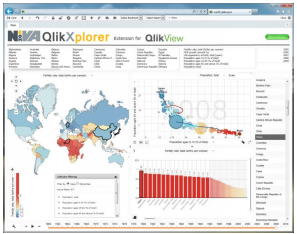
The US business analytics company QlikView (former Swedish company) has selected NComVA as a strategic technology partner for professional interactive data visualization with integrated storytelling. The first integrated product QlikXplorer has been announced on the QlikMarket. NComVA provides QlikView users with advanced interactive statistical and business multivariate visualization as “extensions” seamless integrated  into QlikView using our latest HTML5/JS visualization components.

The combination of QlikView innovative business intelligence and NComVA world-leading interactive data visualization will provide the foundation for a strong partnership for the emerging visual business analytics market. Read also in this blog post which highlights the importance of storytelling and the status it has in NComVA products.

QlikView: http://www.qlikview.com

QlikMarket, NComVA extension: http://market.qlikview.com/ncomva-qlikxplorer-extension.html

Saturday, September 15, 2012

BIG Data and OFFICIAL Statistics

From: http://apdu.org/wp-content/uploads/2012/06/Horrigan_-_BIG_Data_and_OFFICIAL_Statistics.pdf

Statistics. ▫ What are big data? ▫ How big data are already being used. ▫ The future of using big data by statistical agencies ... Big Data and Official Statistics. 3 ...


Sunday, September 9, 2012

New York Times: Data-Driven Discovery Is Tech's New Wave - Unboxed

NYT: Data-Driven Discovery Is Tech'


John Hersey
By STEVE LOHR
Published: September 09, 2012
TECHNOLOGY tends to cascade into the marketplace in waves. Think of personal computers in the 1980s, the Internet in the 1990s and smartphones in the last five years.
Computing may be on the cusp of another such wave. This one, many researchers and entrepreneurs say, will be based on smarter machines and software that will automate more tasks and help people make better decisions in business, science and government. And the technological building blocks, both hardware and software, are falling into place, stirring optimism.

Thursday, August 30, 2012

Finding the Right Tool to Unlock the Power of Data

Published: August 29, 2012 in Knowledge@Wharton
Article Image
hare on facebookShare on twitterShare on emailMore Sharing Services
In the last few decades, statisticians and computer scientists have produced a dazzling arsenal of extremely powerful tools to help managers translate data into business decisions.

Having access to a wide array of versatile solutions is not ordinarily considered a problem in the world of business. But the rise of "big data" has also brought along with it the explosion of mathematical models made possible by today's low-cost computing and storage platforms. Ironically, this poses a number of substantial challenges to managers trying to making sense of ever-growing quantities of information. 

Friday, August 24, 2012

Open Data and the GSS - UK Statistics Authority

From: www.statisticsauthority.gov.uk/.../open-data-and-the-gss.pdf

The GSS is committed to increasing the amount of data released in open and re-usable formats in production of its statistical outputs. This is in line with the UK Government’s policy, as set out in the Open Data White Paper.

Principle 8 of the Code of Practice for Official Statistics states that producers of official statistics should ensure that they are disseminated in forms that enable and encourage analysis and reuse. Producers should release datasets and reference databases, supported by documentation, in formats that are convenient to users.

Principle 5 of the Code of Practice states that official statistics should not reveal the identity of an individual or organisation, or any private information relating to them, taking into account other relevant sources of information. Arrangements for confidentiality protection must be sufficient to protect the privacy of individual information, but not so restrictive as to limit unduly the practical utility of official statistics.

Wednesday, August 22, 2012

Mobile Apps about the American Economy


US Census Bureau Logo


Our users are not only changing how they want our statistics, they’re changing how they access them. To increase and improve access to our statistics, the Census Bureau is providing mobile apps that deliver information when and where you need it.
image of iPad mobile view of New Residential Construction page


America’s Economy

Take the pulse of the U.S. Economy straight from your phone. The America’s Economy app provides real-time updates for 16 key economic indicators released from the U.S. Census Bureau, Bureau of Labor Statistics, and Bureau of Economic Analysis. Key economic measures on employment, manufacturing, international trade, retail sales, and residential construction and sales allow those who follow the U.S. economy to be the first to see whether the indicator has gone up or down since the previous report, and trends over time.

icon image of Google play
Key Features
  • Quick overview of indicators measuring the U.S. economy
  • Detailed page for each indicator with trend data
  • Share indicators on Facebook, Twitter and via email
  • View release schedules for indicators
  • Set up notifications and custom views
Indicators
  • Advance Monthly Retail Sales
  • Advance Report Durable Goods
  • Business Inventories
  • Construction Spending
  • Homeownership Rate
  • International Trade
  • Manufacturers’ Goods
  • Monthly Wholesale
  • New Residential Construction
  • New Residential Sales
  • Personal Income
  • QFR–Manufacturing
  • QFR–Retail Trade
  • Quarterly Services Survey
  • Real Gross Domestic Product
  • Unemployment Rate

Welcome to the world’s first open contest to celebrate excellence and beauty in data visualizations, infographics and information art

From: http://www.informationisbeautifulawards.com/

Tuesday, August 21, 2012

Winners of 2012 award for statistical excellence in journalism announced | RSSeNews


 RSSeNews


August 21, 2012

The winners of the 2012 awards for statistical excellence in journalism have been
announced, with journalists at the Financial Times, the BBC and The Guardian
all recognised for their work.

The awards, now in their sixth year, are made in three categories – print, broadcast and online – and recognise work first published or broadcast in the preceding calendar year.

Thursday, August 16, 2012

Open Data In EU: Big Data At Your Service

Eurozone


August 16, 2012
(CORDIS) — The increasing use of ICT for business, leisure and public services is leading to the accumulation of mountains of structured and in many cases unstructured data. But this so-called ‘big data’ should be seen as an opportunity not a problem. EU research and efforts to promote open data are helping to make sense and good use of this resource.

‘Open data’ is the idea that certain data should be freely available to everyone to use and republish as they wish, without restrictions from copyright, patents or other mechanisms of control. Inspired by the open source software (non-proprietary) and open access (academic publishing) movements, open data is broadly taken to mean the liberal movement, use, re-use or electronic distribution of data.

An important part of this ‘big data’ movement is the use for the wider benefit of society of the non-personal information that citizens share with their governments and public services. Open government data is a tremendous resource that has yet to be fully tapped. ‘Government collects a vast quantity of high-quality data as part of its ordinary working activities. If this data is made open, it can have huge potential benefits,’ notes the Open Government Data (OGD) website, run by the Open Government Working Group.

Read more....

Tuesday, August 14, 2012

Health IT Dashboard from the Office of the US National Coordinator for Health IT


Check Out How HITECH Programs Are Helping
From:  http://dashboard.healthit.gov/

Are you interested in better understanding health IT and the transformative changes that electronic health/medical records are having in our nation's health care system? The Health IT Dashboard presents key information and data to enable collaborative monitoring of the impact of federal policies, programs, and research activities related to health IT. Return to this web site regularly to explore and download new datasets and statistics as they become available.


The ONC Overview Dashboard includes summary information about all of ONC's HITECH grant programs, including their location, funding amount, and contact information.

With the Health IT Dashboard, you can:

  • Generate maps of ONC's planned obligations by state and program (data does not include sub recipients or contracts servicing ONC grants).
  • Learn how ONC's HITECH programs work together to create momentum in EHR adoption and health information exchange activity.
  • Download a full list of ONC HITECH program grantees for your own purposes

Wednesday, July 25, 2012

Computing for data analysis

July 24, 2012 to Statistics by Nathan Yau
If you want to learn visualization, you should learn data. To learn data, you should learn statistics. Where to begin? The free analysis courses offered on Coursera, by Johns Hopkins professors is probably a good place to start. Currently available: Computing for Data Analysis with biostatistics professor Roger D. Peng and Data Analysis with Jeff Leek, also a biostatistics professor.

Tuesday, July 17, 2012

ScienceDaily - Getting to the Bottom of Statistics: Software Utilizes Data from the Internet for Interpreting Statistics


ScienceDaily (July 16, 2012) — Interpreting the results of statistical surveys, e.g., Transparency Internation­al's corruption indices, is not always a simple matter. As Dr. Heiko Paulheim of the Knowledge Engineering Group at the TU Darmstadt's Computer Sciences Dept. put it, "Although methods that will unearth explanations for statistics are available, they are confined to utilizing data contained in the statistics involved. Further, background information will not be taken into account. That is what led us to the idea of applying data-mining methods that we had been studying here to the semantic web in order to obtain further, background infor­ma­tion that will allow us to learn more from statistics."

The "Explain-a-LOD" tool that Paulheim developed accesses linked open data (LOD), i.e., enormous compilations of publicly available, semantically linked data accessible on the Internet, and, from that data, automatically formulates hypo­theses regarding the interpretation of arbitrary types of statistics. To start off, the statistics to be interpreted are read into Explain-a-LOD. Explain-a-LOD then automatically searches the pools of linked open data for associated records and adds them to the initial set. Paulheim explained that, "If, for example, the country "Germany" is listed in the corruption-index data, LOD‑records that contain information on Germany will be identified and further attributes, such as its population, its membership in the EU and OECD, or the total number of companies domiciled there, generated. Attributes that are unlikely to yield useful hypotheses will be automatically deleted in order to reduce the volumes of such enriched statistics.


Explain-a-LOD helps to interpret statistics, like for example the corruption perceptions index by Transparency International. (Credit: Diagram: Transparency International)

Tuesday, July 10, 2012

RSSeNews - ‘Big Data’ event now available to view

‘Big Data’ event now available to view
The Big Data Opportunity event, chaired last week (3 July 2012) by RSS executive director Hetan Shah and featuring cabinet minister Francis Maude, is now available to view on YouTube.
The event was hosted by think tank Policy Exchange, following the publication of its report on how the government could make better use of big data in the public sector. Francis Maude gave a speech about the government’s vision for Big Data and how it could boost efficiency and improve public service delivery.
In his speech, Maude said that an estimated £37billion a year was lost across the public sector ‘through debt, fraud and error – in a large part because of our failure to share data effectively’. He confirmed that the government was to adopt world wide web inventor Tim Berners-Lee’s ’5 Star Scheme’ for assessing the usability of the data as well as appointing a privacy expert, ‘to make sure we bring in the latest expertise on privacy measures.’
Maude’s speech was followed by speeches from James Petter, UK managing director of EMC – the event’s sponsor – and Chris Yiu, head of digital government at Policy Exchange. The speeches were followed by a Q&A discussion chaired by Hetan Shah.
Shah said ‘This event shows there are real opportunities which can come from the open data agenda, but that there are a number of key issues including privacy, data quality and the capability of civil servants which need to be addressed.’

Thursday, July 5, 2012

Weave - Web-based Analysis and Visualization Environment


Open Indicators Consortium Logo
Weave (BETA 1.0) is a new web-based visualization platform designed to enable visualization of any available data by anyone for any purpose. Weave is an application development platform supporting multiple levels of user proficiency – novice to advanced – as well as the ability to integrate, disseminate and visualize data at “nested” levels of geography.

Weave has been developed at the Institute for Visualization and Perception Research of the University of Massachusetts Lowell in partnership with the Open Indicators Consortium, a fifteen member national collaborative of public and nonprofit organizations working to improve access to more and higher quality data.

Read more.....

US demographics by county
The UN Millennium Development Goals in Weave, with an automatic regression line on the scatterplot
Using WMS to overlay satellite images in Map tool
Advanced shape streaming to support parcel level data

Tuesday, July 3, 2012

International Open Government Data Conference: July 6-12 (Virtual and in Washington DC)


July 10-12, 2012
12:30 GMT/8:30 am ET or convert time
We’re expecting over 400 people from more than 40 countries. We’ve got technologists, government officials, civil society organizations and the private sector coming together for 3 days of over a 100 speakers sharing their experiences, stimulating new ideas, and demonstrating the power of putting open data to work.  
Conference topics include: 
- What do successful open government data initiatives look like worldwide?
- How are countries getting started with open data and what are their challenges?
- What are the tools, technologies and platforms for managing and releasing open data?
- How can you engage citizens, the public and private sectors around open government data?
- What's the future of open government data?
See all topics >
Presenters include:
- Caroline Anstey | Managing Director, World Bank
- Steven Van Roekel | Federal Chief Information Officer, United States
- Todd Park | Chief Technology Officer, United States
- Stela Mocan | Executive Director, e-Government Center, Moldova
- Mario Spinelli | Secretary for Corruption Prevention and Strategic Information, Brazil
- Carlos Viniegra | Chief Information Officer, Mexico
- David Eaves | Open Government Advocate, Canada
- David McClure | Office of Citizen Services and Innovative Technologies, United States
- Nathan Eagle | Chief Executive Officer, Jana
- Dr. Rufus Pollock | Co-Founder, Open Knowledge Foundation
- Alexander B. Howard | Government 2.0 Washington Correspondent, O'Reilly Media
...and many more!
All plenaries, keynotes and sessions will webcast on this page and we’ll have a series of hosts running the liveblog below. If you're in Washington D.C, you can still register to attend the conference. 
Join the liveblog and follow #IOGDC on Twitter.
A live blog and webcast will be available at http://live.worldbank.org/international-open-government-data-conference-2012-liveblog-webcast

July 6-7: Lightning talks on the best uses of open data around the world! All virtual at the following times
July 6 from 7:00-11:00 am (EST): http://www.data.gov/communities/conference/virtual-conference
(World time clock: http://www.timeanddate.com/worldclock/fixedtime.html?msg=International+Open+Government+Data+Conference%3A+July+6&iso=20120706T07&p1=263&ah=4 )

July 7 from 2:00-6:00 pm (EST): http://www.data.gov/communities/conference/virtual-conference
(World time clock: http://www.timeanddate.com/worldclock/fixedtime.html?msg=International+Open+Government+Data+Conference%3A+July+7&iso=20120707T14&p1=263&ah=4 )


July 9: Tutorial on Open Data from 1:00-4:30 pm (EST)
(World time clock: http://www.timeanddate.com/worldclock/fixedtime.html?msg=Open+Data+Tutorial+%28IOGDC%29&iso=20120709T13&p1=263&ah=3&am=30)
A live blog and webcast may be available at http://live.worldbank.org/international-open-government-data-conference-2012-liveblog-webcast


July 10-12: International Open Government Conference held at the World Bank Headquarters at 1818 H Street NW, Washington DC. The full agenda is available here:http://www.data.gov/communities/conference
World time clock: http://www.timeanddate.com/worldclock/fixedtime.html?msg=International+Open+Government+Data+Conference%3A+July+10-12&iso=20120710T0830&p1=263&ah=9&am=30 (each day)
A live blog and webcast will be available at http://live.worldbank.org/international-open-government-data-conference-2012-liveblog-webcast

NZ.Stat beta release is now available


Today Statistics New Zealand launched (as Beta) their branded release of the OECD.Stat data warehouse product. (http://nzdotstat.stats.govt.nz )
The work has been done in collaboration with the OECD, ABS and IStat over the last two years to develop this product release in alignment with the rigorous needs of a Statistical Agency.

image, link to nz.stat.  

What is NZ.Stat?

NZ.Stat is a free web tool that will soon be replacing Table Builder. NZ.Stat will allow you to:
  • download large volumes of data (up to 100,000 cells in Excel, and 1,000,000 in CSV format)
  • search for items within dimensions
  • view metadata alongside the table (rather than in a separate window).
NZ.Stat is powered by software provided by the OECD, which is also used by other statistical agencies around the world.

What is the beta release?

The beta release allows you to preview NZ.Stat, but there are still some issues to resolve. We are still working on enhancing the tool. Please tell us what you think of NZ.Stat.
Table Builder remains the authoritative source of tabular data, and all new tables or updates will appear in Table Builder first.  

Wednesday, June 27, 2012

And Now, for Something a Little Different . . . | Director's Blog - US Census Bureau


Posted on 
Bookmark and Share
Several posts ago, I outlined a set of thoughts (The Future of Producing Social and Economic Statistical Information, Part I, Part II, Part III) of how statistical agencies might navigate the future.  How should they react to massive data sets that are being produced daily through internet search, social media, and administrative data processing?  Can these sources of information about social and economic activities be combined in some effective way to reduce the burden of the American public in responding to surveys and censuses?  How should agencies react to increasing demands for more timely and more disaggregated statistical information on the society and the economy?

Tuesday, June 26, 2012

Flowing Data - Chart Chooser helps you choose charts

From: http://flowingdata.com/2012/06/25/chart-chooser-helps-you-choose-charts/

June 25, 2012 to Statistical Visualization by Nathan Yau

Chart Chooser

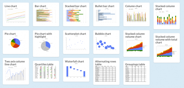
There are a lot of charts to choose from, and if you pick the wrong one you'll end up communicating the wrong message or make it hard for others to read your data. Luckily, Juice Analytics has you covered with an interactive Chart Chooser, based on Andrew Abela's flowchart from a few years ago.
There are toggle buttons on the top that let you filter based on what you're looking for, such as a trend or relationship. For example, if you select comparison, distribution, and composition, you're left with a bar chart. Don't care about distribution? You can also try a stacked bar chart.
There is a second set of buttons that let you choose between Powerpoint or Excel. Once you find the appropriate chart type, you can download the template for the software you selected. Of course, if you're not an Office user, you can always just use it for the choice making.